Those things you used to draw on graph paper, only using javascript.
When creating something like this using a visual library like p5.js, I like to break the task down into more achievable goals that I can write the code for and get each one working one after the other. Having not used this library for a while the goals started off simple and got more technical from there.
Some very quick points about p5.js: – You can easily plot shapes on a canvas using a coordinates system where (0,0) is the top left by default – I’ve specified noLoop() so the canvas only renders once which is useful for static drawing but not for interactive piece which it could be in a later step – I’ve specified the parameters for these lines using the following object to begin with, however there is possibly a better way which I’ll implement later
const lines = {
  line1: {
    start: [20, 20],
    end: [150, 210]
  },
  line2: {
    // use line1.end for the start of line2
    start: [],
    end: [330, 130]
  }
};
Each of the two lines has the same number of evenly spaced points plotted along it
Note that const divisions = 4; is declared at the top and each line has 4 dots along the length as well as an extra one on the end. Also note that the points are drawn on different parts of each of the lines, hence the use of two almost identical functions. The coordinates for the points are pushed to a nested array by these functions and a nested for loop accesses them in the draw function to plot the points.
I’ve also used p5.js’s push() and pop() functions to enclose the lines of code that draw the points. Anything that’s changed inside them like stroke width or colour, or any coordinate transformations that are applied are ignored after the closing pop() declaration. This feature is especially useful in a visual library.
The points have been replaced with lines, using the point’s coordinates as the start and end coordinates for the lines. This animation explains the reasoning behind using a two dimensional array where the two “rows” are the start and end coordinates and a “column” represents one line to draw.
This doesn’t look very impressive at the minute… moving the two main lines around a bit by changing their coordinates as well as increasing the number of divisions to 25 makes it look like it took a lot longer to write the code for. It also shows the benefit of declaring constants instead of hardcoding values into multiple functions.
There were a lot of optimisations to be made in the code. The bulk of my time here was spent breaking down the monolithic functions that calculate the coordinates used to draw the lines. This was good practice in writing more compartmentalised and reusable code. Are the refactored functions perfectly reusable? No, but they are closer to being reusable than what came before them.
Have a look at the code for this step and compare it to the previous step to see all the changes. Here I’ll expand one part of the refactoring process: how I decided to specify the coordinates used to draw the two main lines from step 1.
This is usable but having to comment that line1.end. should be used in place of line2.start is a complete hack and probably not good practice. Also having to specify lines.line1.start[0] every time I need to access a single coordinate value is time consuming and can really crowd up the code.
Therefore I decided to use the following structure instead:
The objects are one layer deep, meaning line1.x2 is all that’s needed to access a coordinate value that previously required lines.line1.end[1].
line1.x2 is a lot more readable, returning the line1’s end point x coordinate.
The second line’s start coordinates can easily be made equal to the end coordinates of the first line since the two objects are defined separately, something that’s not possible in the original single object.
Another option would be to think of the two lines as one path with multiple points, in this case the coordinates for the lines could be defined in an even simpler way:
P5.js has this functionality built in as well. I began the sketch simply drawing two separate lines on the canvas and worked from there. Therefore, the code I’ve ended up writing to plot the lines that make up the curve works using an input of two objects each holding the coordinates for one of the lines. A good next phase would be to rewrite it, replicating the current functionality only but with this new array of path points as an input. Oh and make it all work with more than two main lines to draw curve lines between.
To finish the sketch I added some colour codes for the different parts of the sketch. I was also able to add a bit of interaction by making the point of the two lines follow the cursor and finally, I added a slider to control the number of divisions that make up the curve.
Updates include new colours and a slider to control the number of division
To make the point follow the cursor I simply removed noLoop() from setup and added the following line in the draw function, so they are run every time the sketch is redrawn. Easy.
Click the 0.5x button at the bottom of the codepen embed to hopefully see the whole sketch at once.
Notes
Possible additional features might be:
Having more than just two lines and adapting the functions to work with however many lines are passed into them.
A way to make each of the lines that form the curve a different colour, maybe they could form a gradient across the curve. Even using button presses to cycle through a library of colour schemes.
The basic wordpress plan makes it a pain to nicely embed a project like this, that’s why the code for each step is linked via the headings. All the sketches used in this post are visible together in a collection, linked below.
After reading the brief for this assignment I knew I wanted to focus on the presentation of my different software skills and so this was the focus of my sketching stage.
In my sketches I focused on showing not only my ability to use use certain applications but also the relationships and crossovers between these applications.
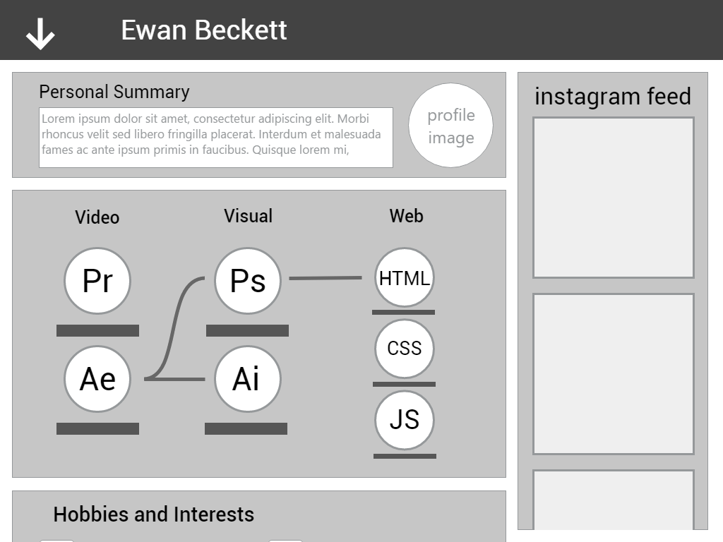
In my wireframes I focused on laying out everything a potential employer might want to see. I used a scrollable design that I feel allows the user to focus on one piece of content at once. I also tried a menu design integrated into the top bar that drops down using an arrow. I saw this as a good opportunity to try the adobe Xd beta software as it has recently been released on windows.
I wasn’t entirely happy with the software skills section of the wireframe so I expanded on one of my ideas that had them displayed separately as well as styled separately to fit their theme. The resulting paper design will be used in place in my final design.
Final Designs:
tapping on the individual menu options would, for example, have a focused view of it fill the screen with an X in the top right to close it
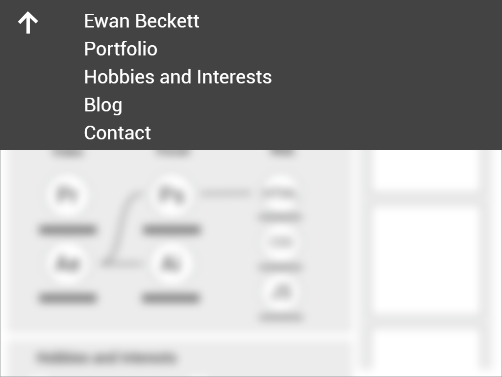
tapping the top left arrow reveals this dropdown menu that also blurs the main view
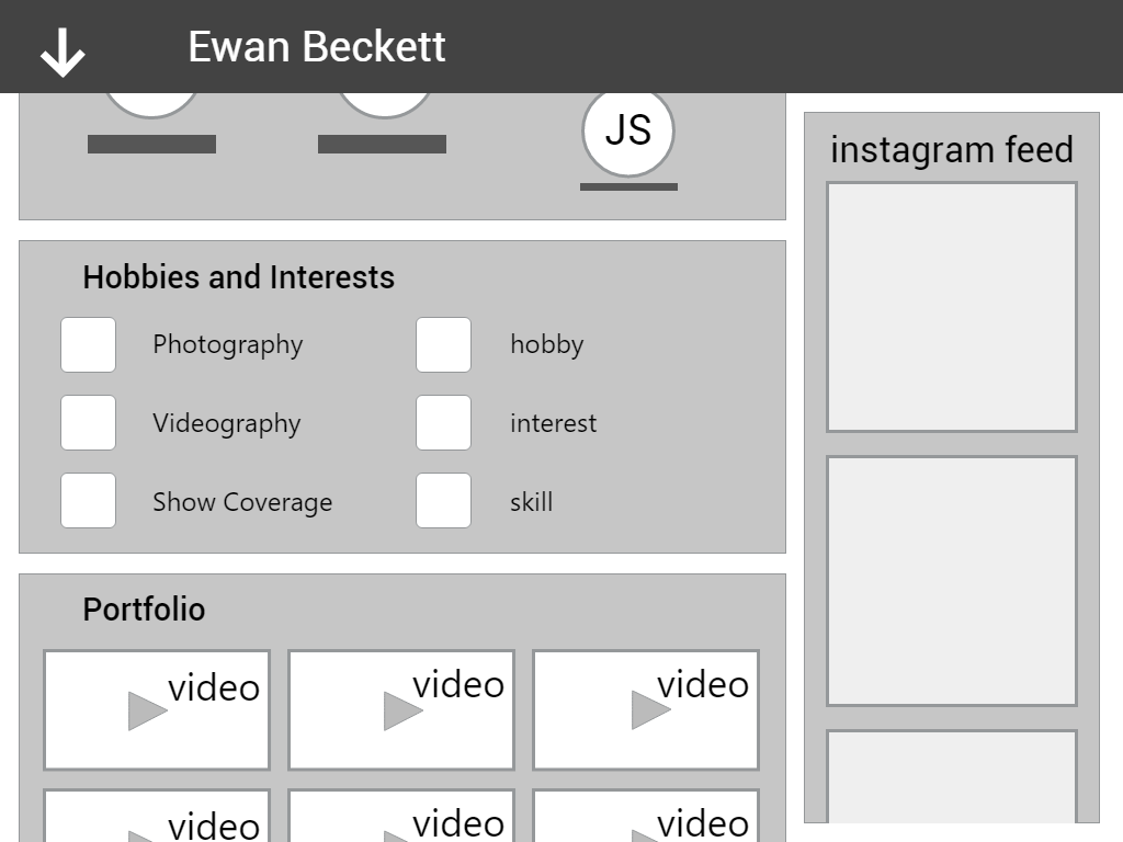
scrolled down view of the main interface
The colour pallet I used was inspired by another portfolio site I found which simply used pastel colours similar to the red and yellow i’ve used here. The icons used in the hobbies and interests section are from flaticon.com.
When placing the icons I tried experimenting by having them not centred or slightly off the yellow backgrounds. I think if they are all like this the effect works well.
Horror isn’t really the genre I would go for personally, unlike a lot of people I know I don’t enjoy being scared while watching a film and can’t see myself enjoying a horror film much less rating my favourite ones. So thankfully the lecture from Victoria McCollum was less about specific films and more on the subject of horror as a film genre. The topics she discussed were things I would have never even considered myself like the effect 9/11 had on the horror genre as well as its history and how it evolved to suit audiences preferences throughout the years.
Victorian also talked a lot about post 9/11 stuff and it’s effect on horror films, an example of which is the beheading of the statue of liberty in the movie cloverfield as well as bush and post 9/11 patriotism and how the patriotism act was basically a do-whatever-we-want-and-get-away-with-it pass.
I learned that horror films, much like any other genre of film, can have underlying messages and hidden themes and often draw on inspiration from real world issues that are occurring arounds the time the movie is made for example vampires becoming a popular film plot around the time of the aids crisis and as I mentioned before, USA and freedom being threatened by invaders in the form of aliens in movies like cloverfield.
“If movies are the dreams of the mass culture then horror films are the nightmares” – Stephen King, Danse Macabre
If i’m speaking honestly I’ll probably reiterate here that I’m not a horror fan although I can appreciate what they’ve done for the movie industry mostly in form of the developments made in makeup and prosthetics based effects because the more you can do in-camera the better. I great example of this is John Carpenter’s The Thing and its effects work by Rob Bottin ,I haven’t seen the film, only learned about it from other sources.
When Prof. Paul Moore first said the word exhibition at the start of class thanks to work assosiation I immediately pictured a white room with paintings in it as I’m sure a lot of the people in the room did at that very moment. I simply remembered going to a few art exhibitions like these with my mother as part of an assignment for my GCSE art project. Prof. Moore then went on to explain that there are in fact many different ways of getting your work seen such as public exhibitions and the online space is a huge factor nowadays, that made me realise that I’ve seen a lot of these other kinds of exhibitions in the news and on social media websites only I’ve never seen them first hand.
Something else that was discussed in class and something I’ve never really thought about before is that choosing where something is displayed or exhibited is extremely important for instance there’s no use putting a large interactive sculpture in a small room against a wall behind red ropes, it needs to be somewhere that suits its design like in a public place or even outside. The way in which a piece is displayed can both enhance it but on the other hand it could detract from the experience. A good example that Prof. Moore gave was the AᗺBA museum in Stockholm whose motto is “Walk in. Dance out.” the curators there have played on the fact that AᗺBA are kind of gimmicky and tailored this museum to be less of a traditional white walls and paintings affair and more of a fun for all the family event, they have stages where you can stand against a green screen and sing with a holographic version of the group as well as touch screens everywhere. And when you leave you can get a digital copy of your time there as all the exhibitions are filmed. Another example was the professor’s own work, his piece on Lough Neagh on which he collaborated with Jem Finer, he called it site specific work because for the art installation to work it had to be on the shore of the lough ie. the location of the art enhanced the art.
I have a vague recollection of the exhibition I mentioned before that I had to visit for a school project, it was in the ulster museum and it consisted of large white rooms with painting hung in them that were just squares of colour layered on thick with oil paints. I had absolutely no idea what to make of it and there was a video playing in one corner that showed the guy creating one of these pieces of “art”, he would slap on the oil paint the scrape a tiny bit off and replace it it with more of the same colour. This all went right over my head and to this day I’m just as oblivious; the point I’m making is that art isn’t for everyone. I would rather see an interactive installation of some sort like the things that you stand on and they light up or make a sound or waving your arms makes projected image move.
wall clock art, source at the end
While doing some googling for this blog I found an article about a video in which someone put a print from ikea in the museum of modern art in Arnhem in the Netherlands. He then asks visitors to look at it and talk to him about it and most of them describe it in a way that only someone who would visit a museum of modern art would. And while it was meant as a joke is kind of shows how location influences someone’s perception of a piece, had they see the print in ikea they probably wouldn’t have given it a second glance but because it was in an important art exhibition one guy said 2.5 million would be a good price for it.
The cool wall clock is in the Ham Yard hotel in London, here’s a longer video of it. I think this is an example of an interesting piece of art because while it might have a deeper meaning like something to do with our perception of time it’s also something you could watch for ages without getting bored.
This week’s blog put me in a bit of a difficult position because I more or less expended all my own thoughts about big data in last week’s blog post, and then Prof. Paul Moore goes and talks about more of the big data this week.
But anyway, we begun this week’s lecture by watching the TED talk The Birth of a Word by Deb roy. It’s about how he captured video of his son development from birth throughout the three years of his life using cameras and microphones installed in the ceilings of all the rooms in his home. Of course capturing his son’s development was the easy part, all of the footage then had to be analysed, he says in the talk that this amounted to 90,000 video and 140,000 hours of audio all of which added up to 200 terabytes of data. They used software to track movement of individuals as well as identify speech. From there they used this data to generate what he called ‘space time worms’, a way of visualising everyday life along the plane of time, something which found to be very interesting because I mentioned in last week’s blog about taking the data that people generate with the wearables and mobile devices and relating it to what they are actually doing in the real word. Roy has a very unique opportunity to visualise and learn from his very actions and habits when it comes to his interaction with his son.
Then they took it one step further and modified the fisheye images from the cameras and used projection mapping to overlay these images onto a 3D model of their home, effectively producing a ‘3D’ tourable video model of their environment although the video was still only 2D so the effect wasn’t fully realised I don’t think. On a side note this part in the talk really reminded me of the film Deja Vu with Denzel Washington where they discover a way to visualise the past in 3D and they use it to solve crimes.
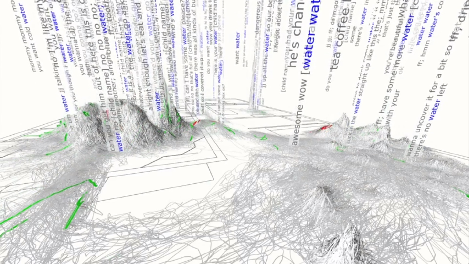
After mapping out the videos from each room the analysed data could then be correlated with it in interesting ways, one of which was they took all of the words that the child learned and highlighted that word in all the transcripts. Because the software had not only transcribed all of the audio but also the location in the house that it had been said this data could be represented visually as what he called wordscapes. The one shown here is the the wordscape for ‘water’ and the place with the highest concentration of this word is in the kitchen as you might expect similarly the wordscape for ‘bye’ had the highest peaks around the front door and entrance hall.
Deb then went on to demonstrate how using these same kinds of data analysis techniques on other things like twitter and major news event uncovered valuable insights into audience interactions and social media influences. This included more 3D visualisations.
This graphic shows the social media users on top and the tv content below with all the lines representing the interactions between the two.
I think the research that Deb and his team are doing now at MIT is the precursor to how companies like IBM and google will look at the data everyone generates in the future.
Another valid point raised in class was to do with the internet of things and that was that you can’t really fully opt-out of it as it’s something that’s being built up as a kind of infrastructure around us all, the world is becoming more connected every day. I agree with all of this but am also interested to see if there will come a limit to how ‘integrated’ everyday people will want to be.
Google glass was also mentioned and this reminded me of a few videos by filmmaker and entrepreneur Casey Neistat because not only was the Explorer edition of google glass quite large and unsightly, earning early adopters the moniker of ‘glasshole’, it was quite impractical in that the display was an ever present prism in the top right of the wearer’s field of view. But apparently project has been reeled back in by the google lab dwellers with the promise that it hasn’t been abandoned just yet.
In this week’s lecture Prof. Paul Moore spoke about a few different things starting with, “the future is mobile” and finishing with “big data is the new oil”, his views on privacy and data hoovering make him seem like a bit of a tinfoil hat, phone in the fridge kind of guy and I’ll elaborate more on that in a bit.
The number of global smartphone users is predicted to reach 2 billion in 2016 after almost getting there in 2015 at 1.91 billion. With these number doing nothing but increasing the idea that mobile is the future couldn’t be any more accurate. The Amazon originals series: Betas was a tv show based on the silicon valley app development smorgasbord and while it only lasted for one series it captured pretty well how the new economy is in mobile apps and services. there’s also random facts such as ‘about ten percent of the photos ever taken have been taken in the past 12 months’ which highlight the fact that with all these smart devices in our pockets there’s a lot of data being generated and who has access to it?
Mobile user statistics chart from eMarketer
In preparation for writing this blog post I thought I should read a few articles on so called ‘Big Data’ and one from the Guardian which talked about big data in relation to the latest and greatest thing: the Internet of Things, or IoT. This new buzz word/term is used when describing smart, connected devices and how they will affect our lives in the future. For example your watch can detect your wellbeing and talk to your phone which will in turn suggest diet changes or generate exercise regimes to fit around your schedule for that day which it of course knows as well. Or your phone knowing that you are on your way home so it talks to your home which switches on the heating for you arriving, and another concept which gets tossed around repeatedly is your fridge knowing what’s in it allowing it to suggest recipes or shopping lists. Many solutions, somewhat like the ones I just mentioned exist today such as nest thermostats but we’re not yet living fully connected lives, yet.
With so many devices communicating and generating data with sensors on everything I think it’s inevitable that someone somewhere will be monitoring it. It’s not all bad however because big data presents a unique opportunity, by properly utilising it we can come closer than ever to seeing into the future by predicting it, simply looking at where we’ve been to give us a better idea of where we’re heading. Oil rigs have over 32,000 sensors on them but the companies that run them only use them for fault detection whereas they could look at what was happening around the fault before and after it occurred, leading to a better understanding of the problem and maybe even preventing it in the future.
On a side note all the data is there the problem faced by a lot of big conglomerates now is how to process it, machine learning is allowing computers to use smart algorithms to analyze data streams and spot patterns and “behaviours” the question I have is how intelligent do we make these algorithms and how much control do we give them?
In class Prof. Moore also discussed social media and the media industry as a whole. Amazon has gone from being an online bookstore to doing almost everything else as well. And twitter want to be the new office water cooler where viewers can have live discussions about events as they are happening, channel 4 for example displays hashtags during a lot of their shows for audiences to use during it. X factor does it as well and this is really the only thing I use twitter for, that and britain’s got talent because a lot of the tweets about the worse contestants can be hilarious.
I think the takeaway from this lecture was that the future of online isn’t exactly clear and we should be warey but not arrfaid.
To open this week’s lecture Prof. Moore spoke about a project he worked on with someone called Jem Finer, a man who I had never heard of who used to play in a band called the Pogues, who I didn’t recognise the name of at first but then remembered they did that christmas song that get played far too early every year.
Anyway Prof. Moore talked about how the people who live on the shores of Lough Neaghs’ houses all face away from it which puzzled me and that they don’t really like the body of water very much, that they see it as an industry more than anything. I don’t live near the Lough at all and not being aware of any of this made me realise that it’s one thing to look at a photo or a piece of footage of the lough in a discover Northern Ireland advert, but an entirely different one to live near it and know everything that goes along with it.
The point of this story became clear when we were shown the piece that the BBC culture show did on the art installation in which Paul Moore was introduced as a “sound artist” a fact that he told us netted him lots of commissions afterwards.It was this one aspect of this one film that changed how he was perceived by others as he said he’d never refered to himself as a sound artist before, and in my opinion this also tells about the difference the reach of something like a BBC piece makes to someones creative presence.
The second part of our lecture was predominantly occupied by Moore’s love for Steve Jobs, a man recognised by some as a god and by others as a tyrant. One of my favourite quotes from him is “People don’t know what they want until you show it to them”. This quote is especially prevalent when it comes to defining new product categories which Jobs was very good at because if Henry Ford had asked his customers what they wanted they would have said a fasted horse. I have no question that Jobs was committed to what he did and that definitely deserves respect however I don’t think I’m as much of a fanatic as perhaps Paul Moore is.
The professor also talked about the ongoing rivalry between apple and microsoft which is something I’m a little more adept at discussing. In an interview that took place right after microsoft’s recent product launch the company’s recently appointed CEO Satya Nadella was asked about the direction that microsoft is going in. His reply was to mention the newly released windows 10 and how he want to focus not on nets and profit margins as a measure of success but rather on how consumers enjoy using windows as a service/ecosystem. He says it far better himself in this video.
Paul Moore told us about how, in the beginning, microsoft as a company catered mostly to the military while apple’s macintosh was a computer “for the people” and while apple hasn’t really changed their ethos since then I think this quote from Nadella sums up microsoft’s evolution from their roots to where they are now.
Interviewer: “Why does microsoft exist?” Satya Nadella: “To empower other people and organisations through digital technology to achieve more, that’s it”
With this being the first class with mr Paul Moore I didn’t know what to expect. Straight away it’s obvious he’s been doing this for a while and has gotten pretty good at it.
An introduction is what the planner said it would be and an introduction is what we got, Paul spoke about some familiar topics and some not so familiar to me. I was interested when he mentioned TED talks as I’m familiar with these myself.
Creativity is a broad and diverse topic, for me when I think of creativity as a concept my first thought is problem solving, during A-level moving image arts I had an idea for my film piece that required a specific piece of camera mounting equipment, it existed but as with most things marketed as camera equipment the price meant it was completely out if the question for my project. I saw this as both an obstacle and a challenge. I enjoy designing something I can build myself and then seeing that project through, so I designed and built a thing that straps to someone’s waist and when a gopro is attached and positioned correctly it gives a 3rd person view of that person’s actions. I used it as part of my film project, even going as far as to document it in my write up. This is what I think of when I hear creativity. I am a huge fan of a filmmaker turned social media mogul called casey neistat. Casey left the filmmaking and advertising business to pursue a different goal in his life, to make a tool that would make as easy as possible for people to create, make and change social media. In short he made a mobile app called beme that enables instantaneous creation and distribution of personal videos, the video that he made for it explains this a lot better that I can.
In conclusion everyone will think of something different when the hear the word creativity, no you know what I think.


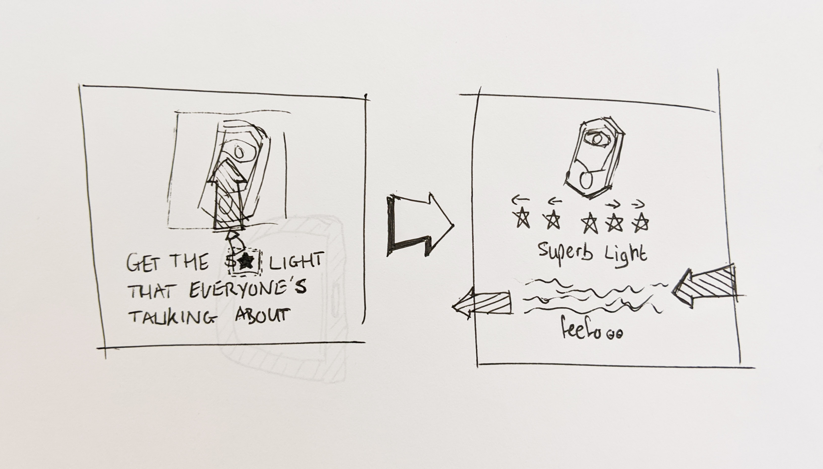


 In my wireframes I focused on laying out everything a potential employer might want to see. I used a scrollable design that I feel allows the user to focus on one piece of content at once. I also tried a menu design integrated into the top bar that drops down using an arrow. I saw this as a good opportunity to try the adobe Xd beta software as it has recently been released on windows.


 professor’s own work, his piece on Lough Neagh on which he collaborated with Jem Finer, he called it site specific work because for the art installation to work it had to be on the shore of the lough ie. the location of the art enhanced the art.