Those things you used to draw on graph paper, only using javascript.
When creating something like this using a visual library like p5.js, I like to break the task down into more achievable goals that I can write the code for and get each one working one after the other. Having not used this library for a while the goals started off simple and got more technical from there.
Some very quick points about p5.js: – You can easily plot shapes on a canvas using a coordinates system where (0,0) is the top left by default – I’ve specified noLoop() so the canvas only renders once which is useful for static drawing but not for interactive piece which it could be in a later step – I’ve specified the parameters for these lines using the following object to begin with, however there is possibly a better way which I’ll implement later
const lines = {
line1: {
start: [20, 20],
end: [150, 210]
},
line2: {
// use line1.end for the start of line2
start: [],
end: [330, 130]
}
};
Each of the two lines has the same number of evenly spaced points plotted along it
Note that const divisions = 4; is declared at the top and each line has 4 dots along the length as well as an extra one on the end. Also note that the points are drawn on different parts of each of the lines, hence the use of two almost identical functions. The coordinates for the points are pushed to a nested array by these functions and a nested for loop accesses them in the draw function to plot the points.
I’ve also used p5.js’s push() and pop() functions to enclose the lines of code that draw the points. Anything that’s changed inside them like stroke width or colour, or any coordinate transformations that are applied are ignored after the closing pop() declaration. This feature is especially useful in a visual library.
The points have been replaced with lines, using the point’s coordinates as the start and end coordinates for the lines. This animation explains the reasoning behind using a two dimensional array where the two “rows” are the start and end coordinates and a “column” represents one line to draw.
This doesn’t look very impressive at the minute… moving the two main lines around a bit by changing their coordinates as well as increasing the number of divisions to 25 makes it look like it took a lot longer to write the code for. It also shows the benefit of declaring constants instead of hardcoding values into multiple functions.
There were a lot of optimisations to be made in the code. The bulk of my time here was spent breaking down the monolithic functions that calculate the coordinates used to draw the lines. This was good practice in writing more compartmentalised and reusable code. Are the refactored functions perfectly reusable? No, but they are closer to being reusable than what came before them.
Have a look at the code for this step and compare it to the previous step to see all the changes. Here I’ll expand one part of the refactoring process: how I decided to specify the coordinates used to draw the two main lines from step 1.
This is usable but having to comment that line1.end. should be used in place of line2.start is a complete hack and probably not good practice. Also having to specify lines.line1.start[0] every time I need to access a single coordinate value is time consuming and can really crowd up the code.
Therefore I decided to use the following structure instead:
The objects are one layer deep, meaning line1.x2 is all that’s needed to access a coordinate value that previously required lines.line1.end[1].
line1.x2 is a lot more readable, returning the line1’s end point x coordinate.
The second line’s start coordinates can easily be made equal to the end coordinates of the first line since the two objects are defined separately, something that’s not possible in the original single object.
Another option would be to think of the two lines as one path with multiple points, in this case the coordinates for the lines could be defined in an even simpler way:
P5.js has this functionality built in as well. I began the sketch simply drawing two separate lines on the canvas and worked from there. Therefore, the code I’ve ended up writing to plot the lines that make up the curve works using an input of two objects each holding the coordinates for one of the lines. A good next phase would be to rewrite it, replicating the current functionality only but with this new array of path points as an input. Oh and make it all work with more than two main lines to draw curve lines between.
To finish the sketch I added some colour codes for the different parts of the sketch. I was also able to add a bit of interaction by making the point of the two lines follow the cursor and finally, I added a slider to control the number of divisions that make up the curve.
Updates include new colours and a slider to control the number of division
To make the point follow the cursor I simply removed noLoop() from setup and added the following line in the draw function, so they are run every time the sketch is redrawn. Easy.
Click the 0.5x button at the bottom of the codepen embed to hopefully see the whole sketch at once.
Notes
Possible additional features might be:
Having more than just two lines and adapting the functions to work with however many lines are passed into them.
A way to make each of the lines that form the curve a different colour, maybe they could form a gradient across the curve. Even using button presses to cycle through a library of colour schemes.
The basic wordpress plan makes it a pain to nicely embed a project like this, that’s why the code for each step is linked via the headings. All the sketches used in this post are visible together in a collection, linked below.
“Eyevan” is a multi-disciplinary work created as part of my university dissertation with the aim of investigating if an interactive installation can be affective.
The user(s) – up to 3 people at a time, wear headbands with infrared LEDs on them and a camera with an IR pass filter installed internally produces an image that is trackable with Max. This tracking info is then send to the JS running in the browser using socket.io as a bridge.
A webapp is running in the browser from a local node server, this is where the p5.js library is used. Programmable shapes allow the eyes to be animated programmatically an respond to the people in the room. The eyes in this case have no inherit emotions of their own, because the eyes have a low level of visual detail it is the user themselves who applies the emotion to the eyes as they are viewing them. Therefor the installation is affective.
As part of this project I compared 2D and 3D animating techniques for the eyes. p5.js has 3D rendering capabilities utilizing webGL. This determined that 2D made more sense for the desired outcome and was easier to animate in the desired way.
I wanted to challenge myself with this project, at the begining when I was pitching the concept to the rest of my class I had a sort or idea of how I would make each part and what software I’d use but nothing concrete. I enjoyed learning to use p5.js and max in new ways and was rewarded with a great feeling when everything eventually worked.
A part of this project that I didn’t imagine would be as big a part was the computer vision element. I ended up removing the IR cut filter from an xbox camera and replacing it with a piece of LEE 87 IR pass filter material to create a camera that could see the IR LEDs in the headbands mentioned before. see this other post for more on that
Maybe at some point I’ll make the code available here or on github, I’d need to tidy everything, especially the max patch.
A mention need to go to this github repo where I found the solution to getting data from max into javascript in an open browser window.
Inside a curtained off area in which the installation was run properly for the first time
the curtained off corner where Eyevan was presented
one of the IR tracking headbands
all 5 headbands completed
a sanded LED inside the paper reflector
the almost reassembled camera
the naked camera PCB with lens attatched
early testing of the 3D eyes
The parameters of the arc() shape that is used to render the eyes. The shape and its cut out are controlled and animated from scratch using variables.
Comprehensively breaking a logitech webcam trying to remove the IR filter before doing what should have been done in the first place.
This slideshow requires JavaScript.
After looking at a guide online for how to IR modify the Logitech C270 webcam I thought all it would take was a little heat to melt the glue. As it turns out n my newer model of the device the filter is fused to the sensor meaning my attempt to remove the glass brought the entire sensor with it.
This slideshow requires JavaScript.
Xbox vision cameras are known for being easy to remove the IR filter from. They are popular with astral imaging enthusiasts for attaching to telescopes. The small IR cut filter is in the lens in front of the sensor and can simply by pried out.
The only other modification I think will be necessary is to do something about the 4 green LEDs that illuminate the ring around the lens when the camera is in use.
Simply googling “IR modify [insert webcam model here]” was how I found the appropriate steps for these mods.
Actually I woke up having only just been dreaming about something I know not what and the only part of that dream still in my mind was a concept of mice wandering over a computer keyboard and everything they typed being turned into the word “harvest”. Weird, I know.
So I stuck this down on a post it note as it seemed like an interesting coding exercise.
For this post I’ll simply focus on what I needed to learn in order to make this work, text parsing in javascript.
Using recently gained knowledge about selecting elements in the DOM combined with this post on stack overflow. This was found by searching along the lines of “removing the last word from a string javascript”, because efficient googling is a very undervalued skill at present.
I also like to put as much work down on a whiteboard as possible before starting to code. I’ve sketched out the html elements and made a to-do list of sorts. Originally I thought I’d be using an <input> element however I ended up using a <textarea>.
the to-do list on the whiteboard then translates into the code building
Information about keyboard presses as DOM events was also found here.
The entire project can be accessed here: on github
And used here thanks to GitHub pages, which is a recent and amazing discovery: Rich Harvest. NOTE: there is no support for mobile yet, I’ve branched the project with that addition in mind.
The only problem I ran into was with editing the content (or .value) of the <textarea> as a static variable instead of as live DOM element.
Pretty fun one-page web project, 10/10, would harvest again.
Spotify’s promotional and social media material, especially their in-feed adverts for 3 months premium membership for £9.99, has a look that involves shapes and “bold” colours. Not huge colours but eye catching at least.
It was the squiggly line especially that got me wondering how I would make them in illustrator…? So I used adobe illustrator and threw shapes at an artboard till it looked good, and while I was doing that I looked at the colours I was pulling from adobes color website and thinking what i would look like if the hue was animated in after effects as I’ve tried this during other projects in the past.
So I pulled the finished image into Photoshop and added a hue/saturation adjustment layer.
apologies for low image quality
The final image – currently the header image for this site (this may have changed at time of reading)
While the image was in Photoshop I tried making it black and white as I was curious what it might look like with a single colour overlay. Then after trying a gradient map adjustment layer it seems as thought the base image could be adapted to suit any theme on a site or for a brand for example.
Black and White just using the default Photoshop black and white adjustment layer preset
I intend to experiment more with this style in the future and would like to find out if I can increase the aesthetic quality by adjusting the positioning of the shapes or what shapes are used etc… There really are a million options for this style.
While creating some animated line drawings I wanted to make them slightly more visually interesting than simply adding easing.
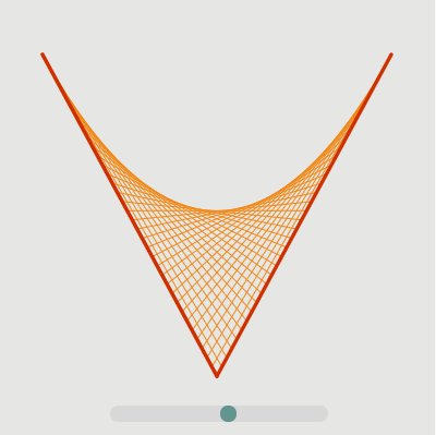
Posterize time is an effect which essentially reduces the amount of frames outputted. It gives a great look to motion graphics and works especially well when the animation keyframes have a decent amount of easing applied.
The appearance of motion blur is also reduced by this effect so you might want to experiment.
The original line drawing was created in illustrator and then imported into Ae there’s plenty of guides for how to do this online.
After reading the brief for this assignment I knew I wanted to focus on the presentation of my different software skills and so this was the focus of my sketching stage.
In my sketches I focused on showing not only my ability to use use certain applications but also the relationships and crossovers between these applications.
In my wireframes I focused on laying out everything a potential employer might want to see. I used a scrollable design that I feel allows the user to focus on one piece of content at once. I also tried a menu design integrated into the top bar that drops down using an arrow. I saw this as a good opportunity to try the adobe Xd beta software as it has recently been released on windows.
I wasn’t entirely happy with the software skills section of the wireframe so I expanded on one of my ideas that had them displayed separately as well as styled separately to fit their theme. The resulting paper design will be used in place in my final design.
Final Designs:
tapping on the individual menu options would, for example, have a focused view of it fill the screen with an X in the top right to close it
tapping the top left arrow reveals this dropdown menu that also blurs the main view
scrolled down view of the main interface
The colour pallet I used was inspired by another portfolio site I found which simply used pastel colours similar to the red and yellow i’ve used here. The icons used in the hobbies and interests section are from flaticon.com.
When placing the icons I tried experimenting by having them not centred or slightly off the yellow backgrounds. I think if they are all like this the effect works well.