
Art Geko? Art Deco? …
Inspirations:
https://www.instagram.com/p/BdBVL14Fpjd/
Process:
Spotify’s promotional and social media material, especially their in-feed adverts for 3 months premium membership for £9.99, has a look that involves shapes and “bold” colours. Not huge colours but eye catching at least.
It was the squiggly line especially that got me wondering how I would make them in illustrator…? So I used adobe illustrator and threw shapes at an artboard till it looked good, and while I was doing that I looked at the colours I was pulling from adobes color website and thinking what i would look like if the hue was animated in after effects as I’ve tried this during other projects in the past.

So I pulled the finished image into Photoshop and added a hue/saturation adjustment layer.

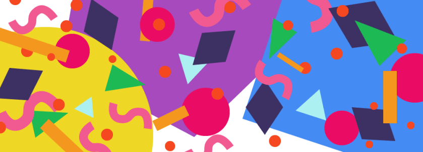
While the image was in Photoshop I tried making it black and white as I was curious what it might look like with a single colour overlay. Then after trying a gradient map adjustment layer it seems as thought the base image could be adapted to suit any theme on a site or for a brand for example.


I intend to experiment more with this style in the future and would like to find out if I can increase the aesthetic quality by adjusting the positioning of the shapes or what shapes are used etc… There really are a million options for this style.
